.png)
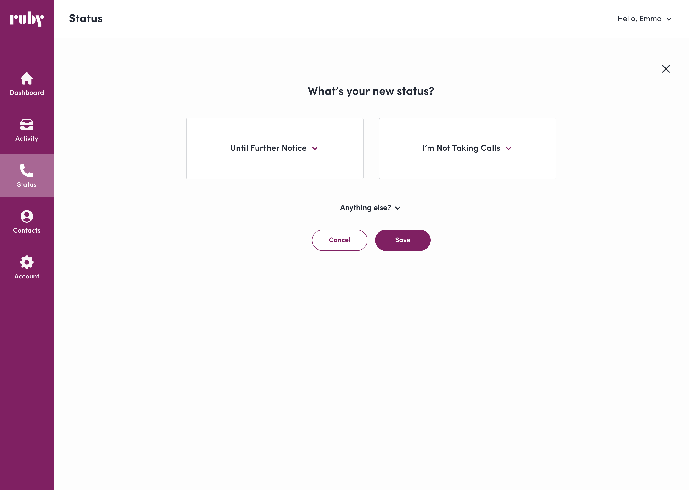
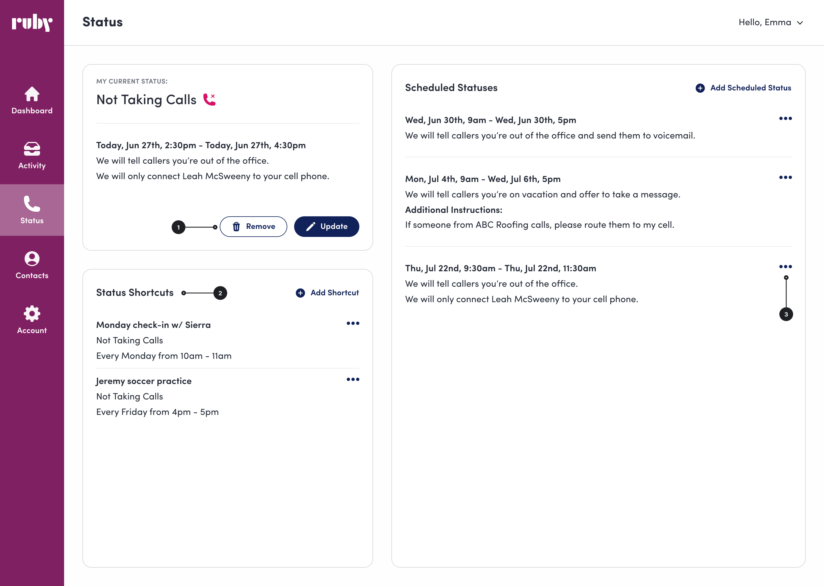
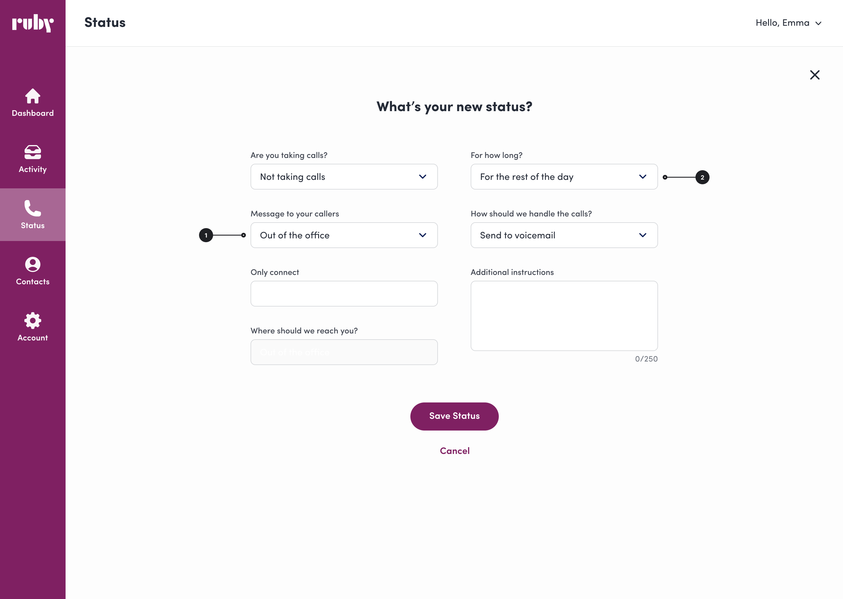
Ruby helps small business owners manage calls through a mobile and web app, allowing them to adjust their availability or "status." After completing a major internal project, my team shifted focus to the long-overlooked customer portal. A heuristic review revealed widespread usability issues, leading my PM and me to prioritize redesigning the Status page.

Screens for setting a status before the redesign
.png)

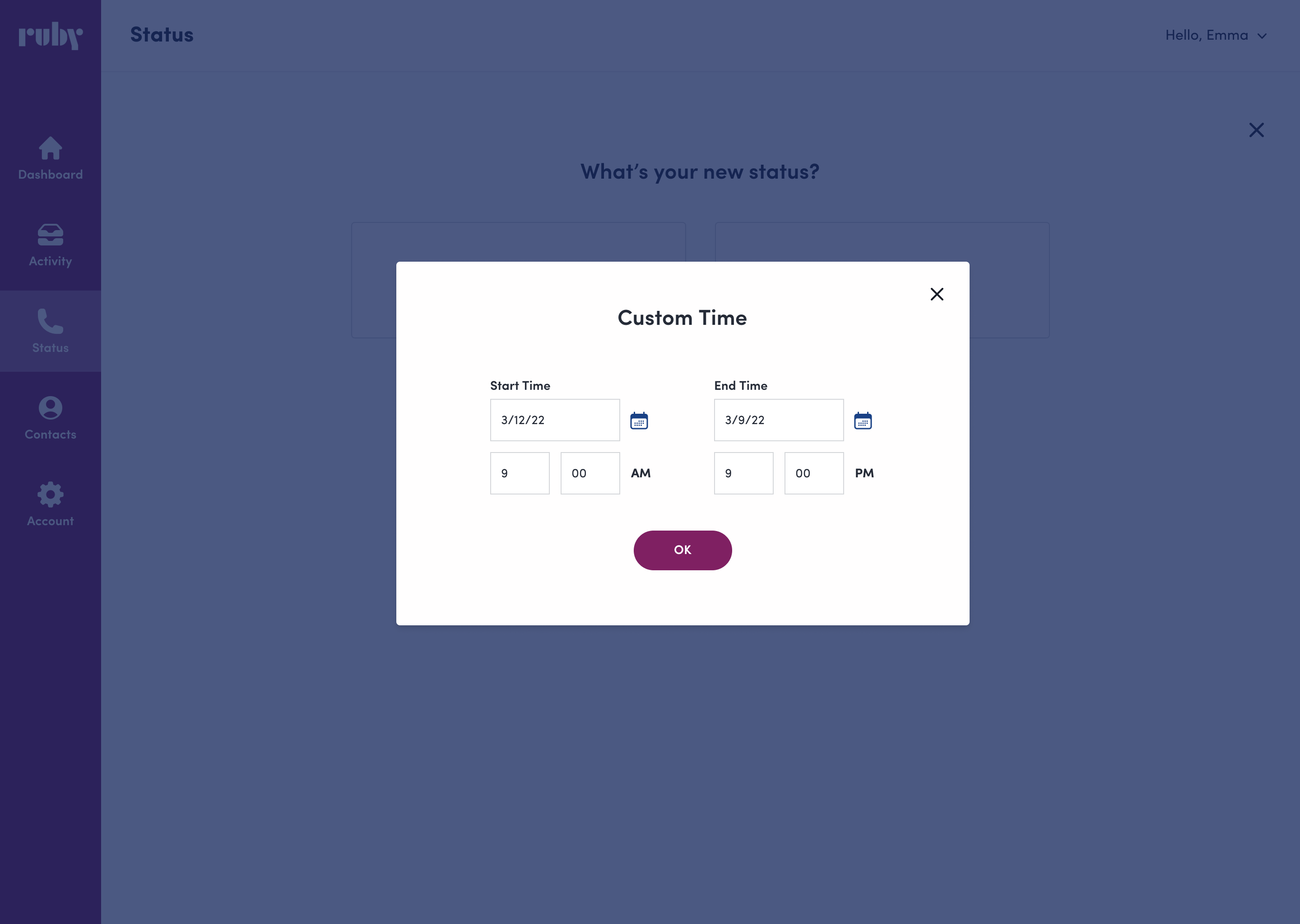
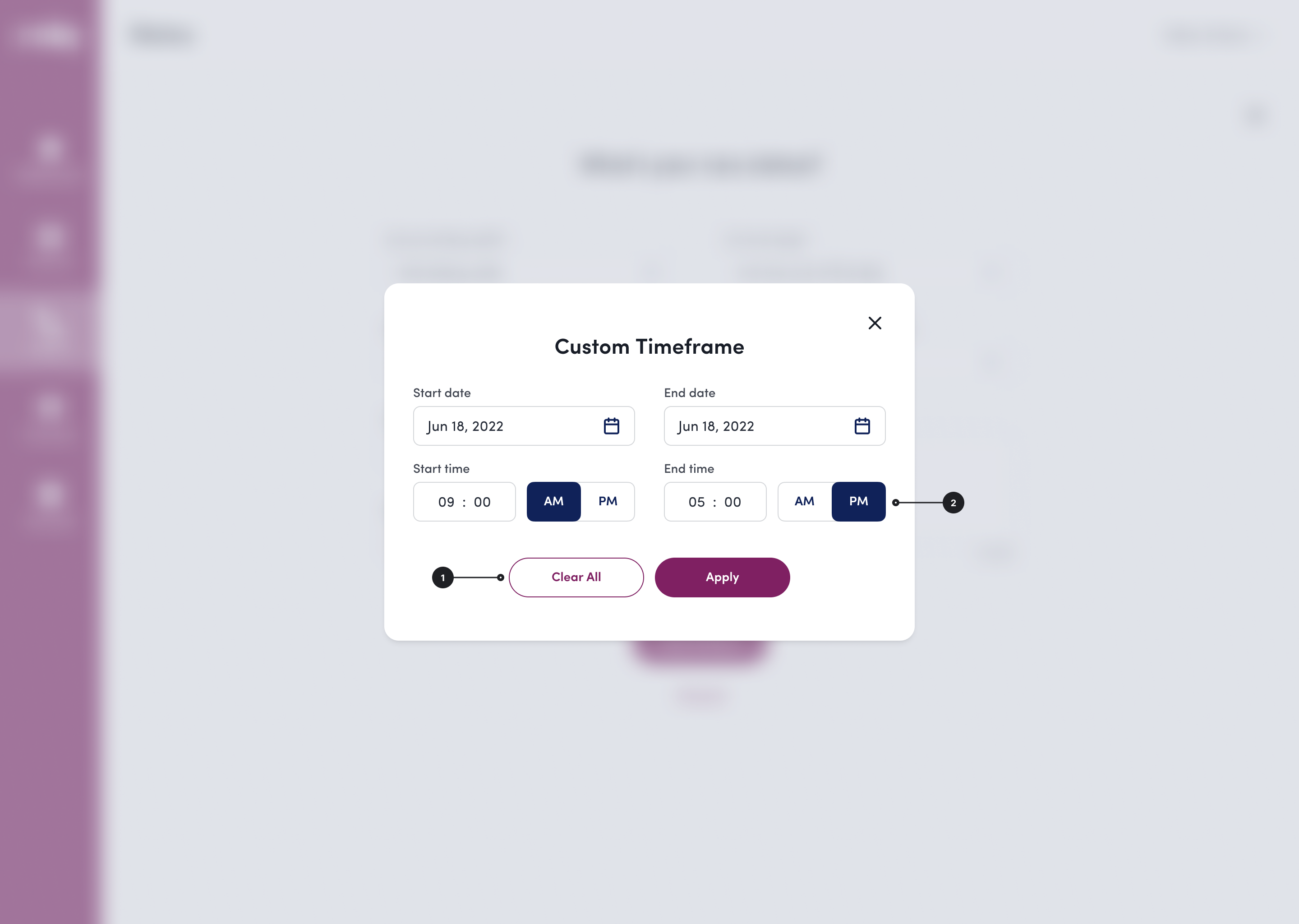
To simplify flows and reduce user errors, I worked with engineers to address challenges with handling both typed dates and a calendar picker. I streamlined the flow by making the calendar picker the sole option, creating a clearer user experience while reducing complexity for engineering.
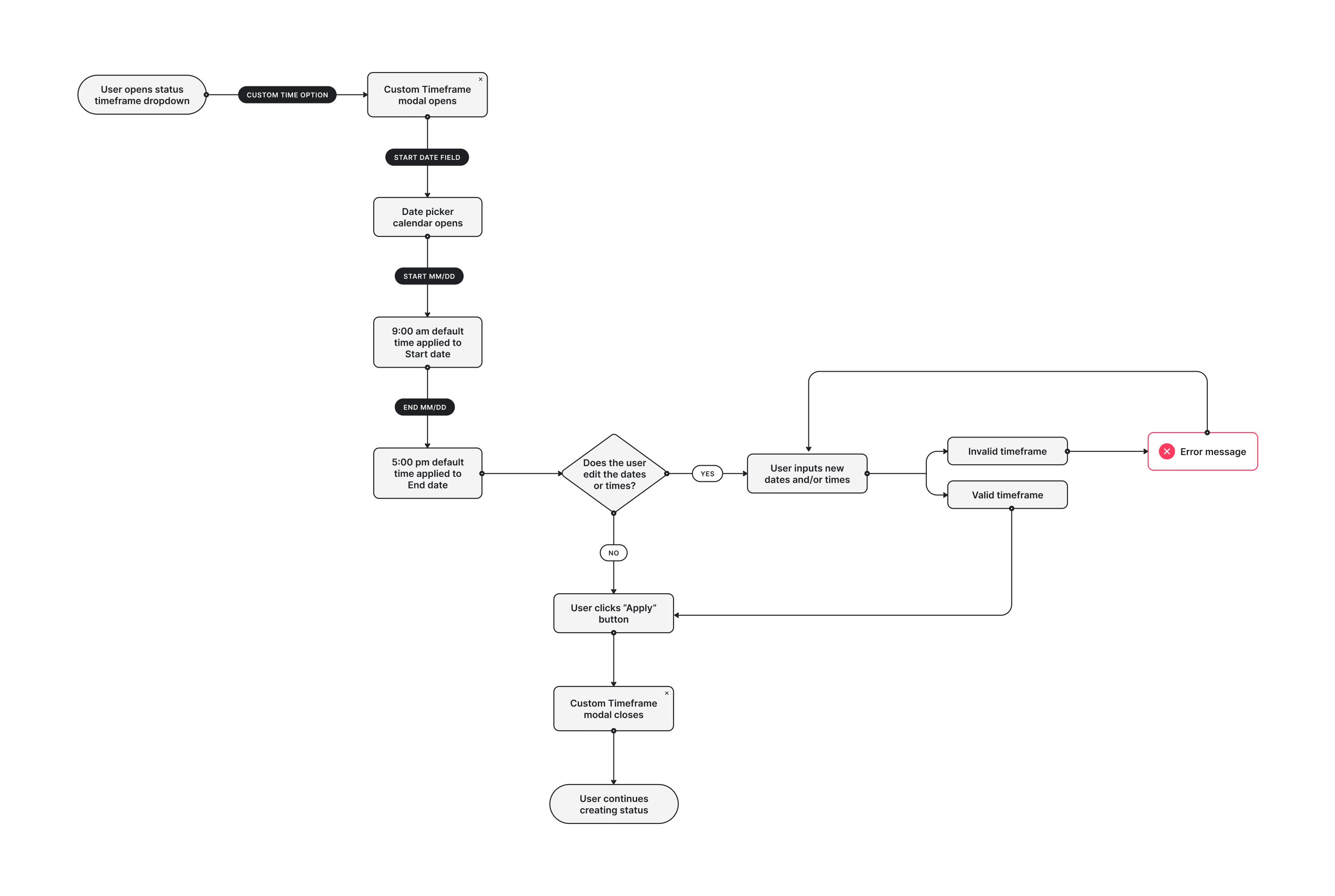
I made previously hidden UI elements more visible and created a toggle button to make AM/PM selection for custom status timeframes clearer.

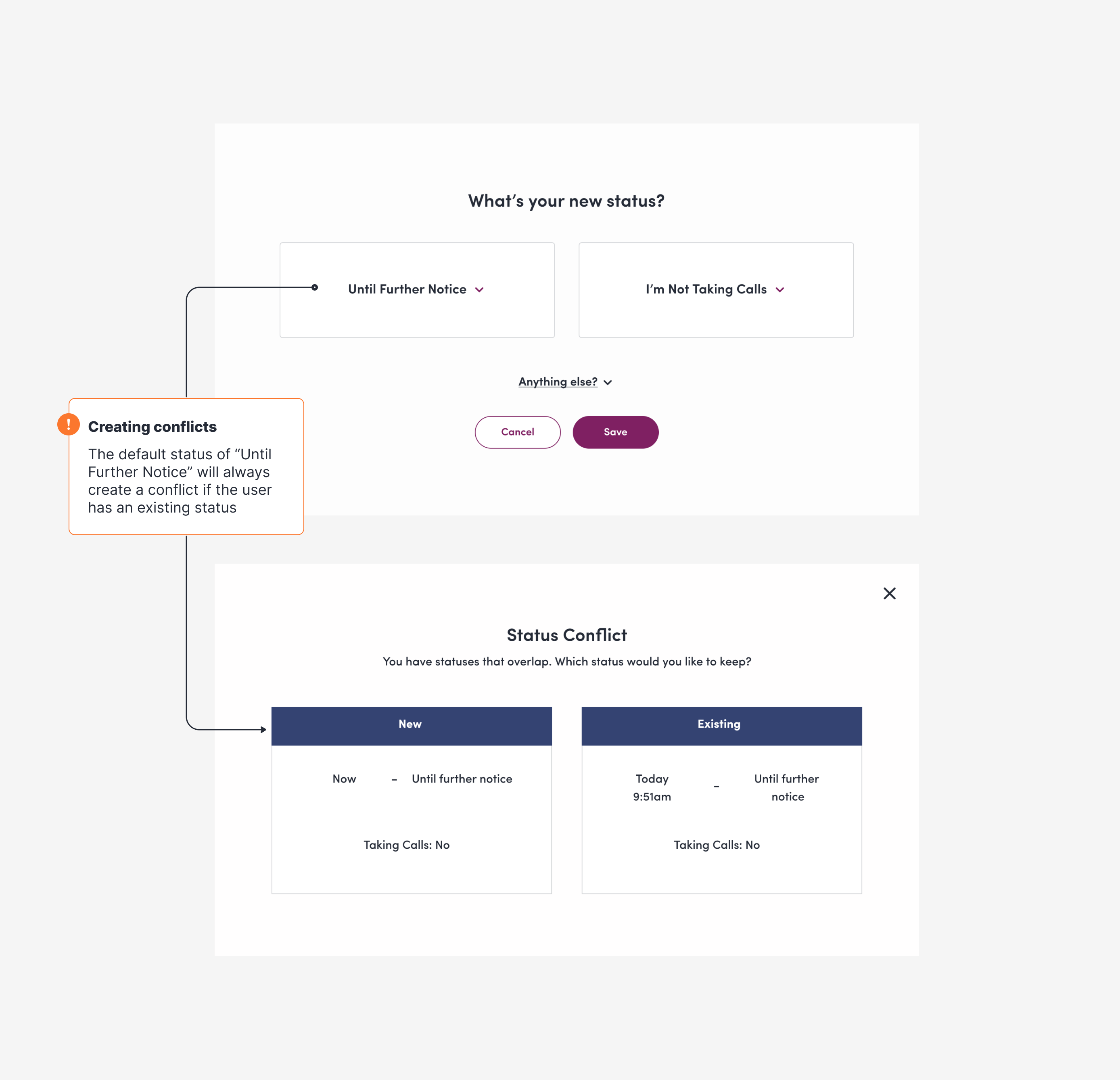
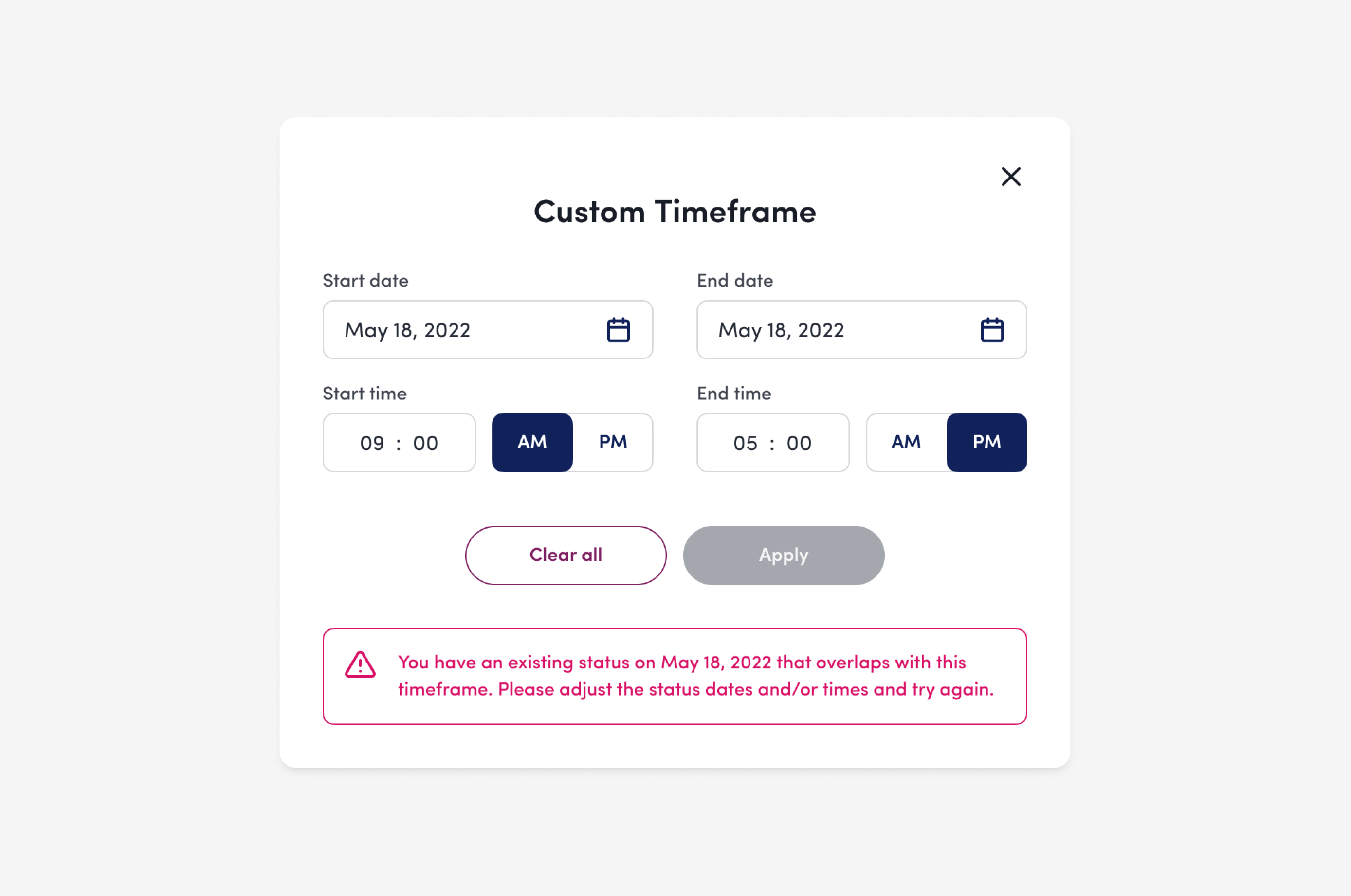
Engineering constraints would make refactoring the Conflicting Status modal a large ask. Instead, I moved away from the confusing “choose one or the other” flow, opting for a direct error message at the status creation point that is clear, concise, and highly visible.
Click the image to toggle between before and after
Click the image to toggle between before and after
Click the image to toggle between before and after
After simplifying flows to reduce unhappy paths, improving error messaging, and streamlining UI elements, I am proud to say that these changes to the Status page have made an impact to customers and internal colleagues alike.
Decrease in status-related support tickets
Completion rate in usability tests with customers
.png)
Ruby receptionists help small business owners nationwide handle calls and leads remotely. While the Ruby mobile app let customers manage many communications, they couldn’t easily edit key account details about themselves or their business at the time.
As Ruby grew, so did the Customer Success team's workload. Product leaders thought better self-service options in the apps could ease their load. But with customer account information spread across tools, it was crucial to ensure updates synced accurately everywhere.
.png)
Working with the fantastic designer Macie Groves, we began discovery research by interviewing the Onboarding and CS teams to understand their touchpoints with account information.
Through our research, we found the most common requests regarding account updates were:
Adding a new employee
33 avg. monthly requests
Removing a current employee
24 avg. monthly requests
Editing company information
23 avg. monthly requests
CS and Onboarding teams struggled with updating account info across multiple tools. As Ruby grew, account data was introduced into different products and tools piecemeal. While some products synced, others didn’t, requiring extra effort to keep the data accurate across all platforms.
.png)
I found making a Gane-Sarson diagram helped myself and others visualize how account data moved between Ruby products.
Using our discovery research, we began to brainstorm around the question:
How might we offer self-service flexibility to our customers while keeping back end processes intuitive and simple?
It became clear that our solution had to include restructuring the flow of data, otherwise we would be creating more work for CS, not less.
.png)
New data flow now that products can talk to each other!
While engineers worked on the backend, I began designing the Account screens to allow for customer edits. User testing revealed customers wanted control over how calls and messages were routed to their employees.
- Customer quote from usability tests
My solution to this was adding in a “Do not share” checkbox with contact information fields. This allowed for coworkers within the same company to view each other's contact information, while keeping it private to outside callers.
.png)
Another change to the design was made after CS leaders determined that allowing customers to remove an employee on their own was high risk, due to what Ruby calls “call handling instructions.”
For example, if the call handling instructions at ABC Company say that any calls after 2pm should be routed to Bob, but the owner of ABC Company removed Bob from the account, a receptionist might be left in a lurch trying to figure out where to route the call.
.png)
My solution for this was to include a flow that triggers an email alert when a customer removes an employee from their directory. The Account Manager checks if call handling instructions are impacted. If not, they remove the employee in Salesforce, which syncs the change to PRL and ROS. If instructions are affected, they contact the customer to find a solution.
.png)
.png)
This project was very satisfying to work on, as it provided a better experience for both customers and internal teams. More self-service options empowered customers to make their own account updates, freeing up time for CS and Onboarding to focus on providing exceptional service. And, syncing account changes across products streamlined internal workflows, helping to reduce redundancy and errors.
Decrease in requests to add an employee
Decrease in requests to edit company info
ThriveWell helps connect students and faculty at higher-ed institutions to virtual health and well-being services. Members can schedule visits with licensed therapists and medical doctors, browse self-help resources, and connect with a community of peers.
In early 2024, 12% of scheduled visits were canceled within 24 hours, leading to costly reimbursements to providers. Stakeholders originally suggested more call and text visit reminders, but ran into legal limitations due to the Telephone Consumer Protection Act.
.png)
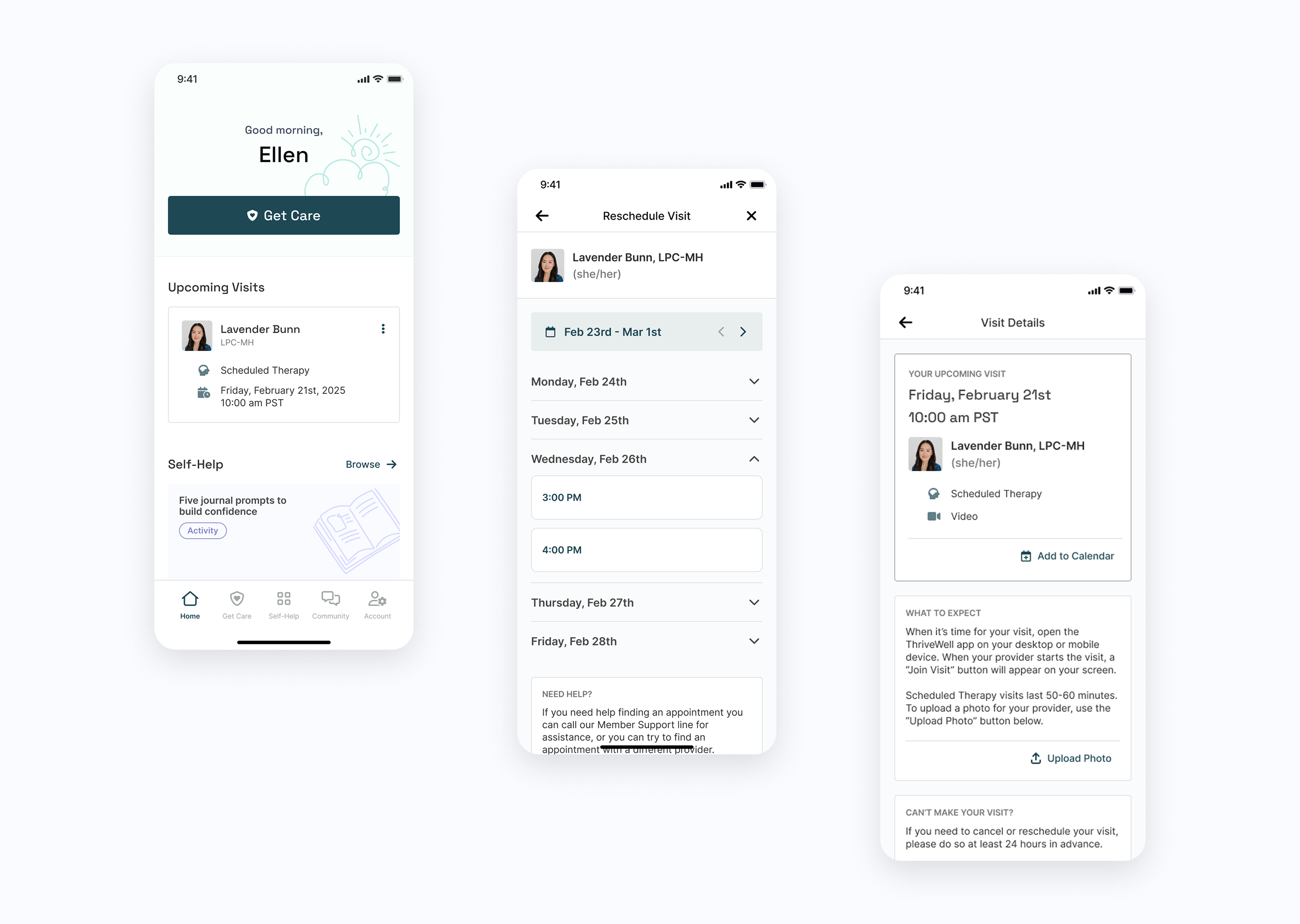
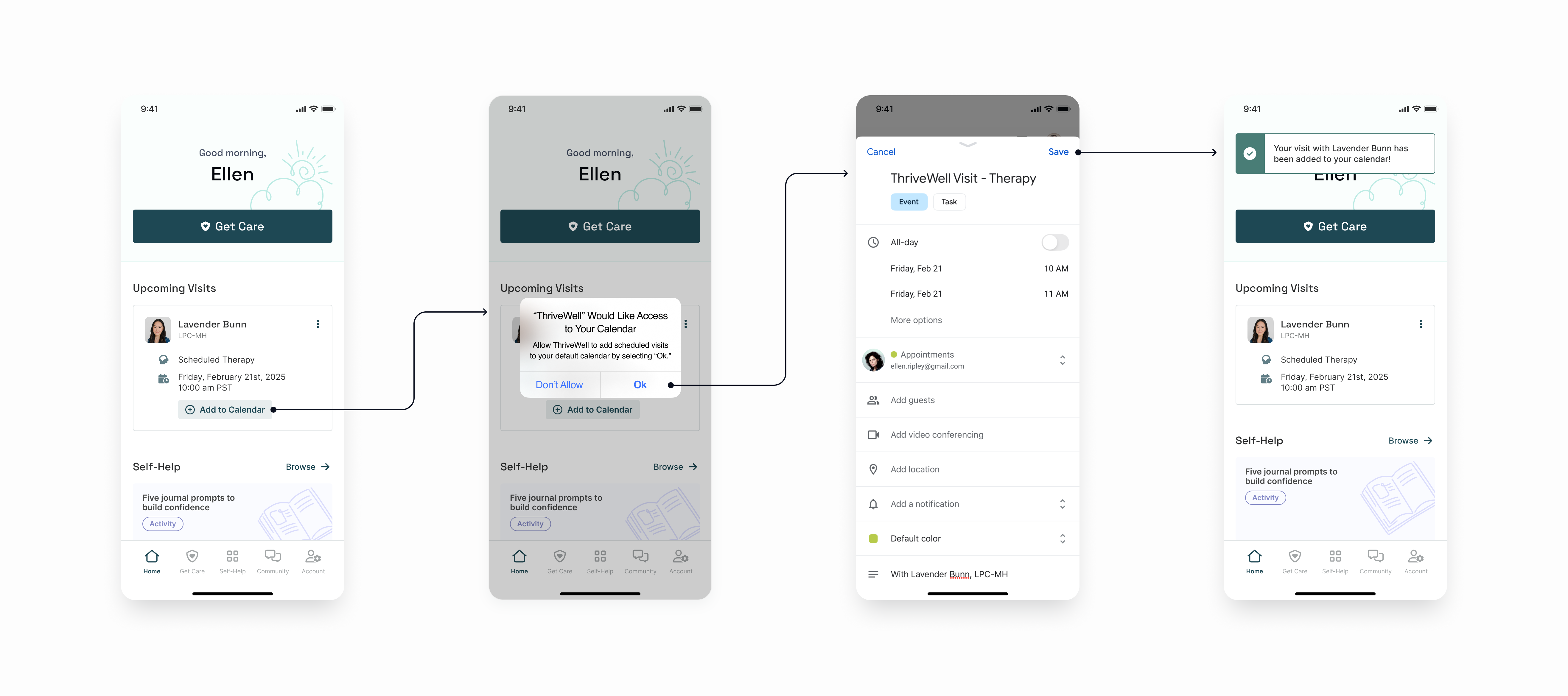
To improve visit retention, my PM and I proposed an ‘Add to Calendar’ button, allowing members to receive native calendar reminders. After stakeholders agreed (with the requirement that the button would be highly visible on the home screen), I got to work and began putting together a rough outline of the user flow.
Around this time, stakeholders requested an enhancement to improve visibility into rescheduled visits. Members had to cancel before booking a new visit, but there was no way to indicate they were rescheduling. This led to inaccurate visit data since CS couldn’t tell which were true cancellations versus those that led to a reschedule.
.png)
To accurately track rescheduled visits, members and CS needed the option to reschedule a visit without canceling it first.
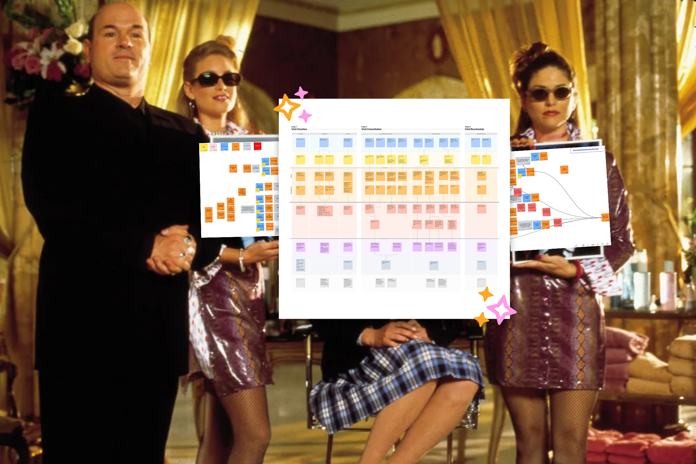
Before ideating, I met with CS, engineers, and stakeholders to understand current functionality and constraints. Engineering mapped out their interpretation of the existing reschedule flow in Miro, but it lacked readability and was mostly centered around technical backend structures.
Using my notes and their file, I created a UX map that included CS, member, and engineering touchpoints. This provided stakeholders and cross-functional teams with a more readable artifact to refer to during future planning discussions.
Only Paolo Karina can take this, and this, and give you...
... a princess!

Leveraging the UX map, engineering and stakeholders identified feasible options for the first iteration of rescheduling visits, and I began designing a flow that allowed members to reschedule without canceling.
After running into engineering constraints, I compromised with stakeholders and engineers to move the 'Add to Calendar' button off the home screen and into the Visit Details screen. I also integrated it into an existing modal that appeared during the final steps of scheduling a visit, keeping it highly visible—one of CS’s top priorities.
.png)

Members and CS members can now reschedule a visit without needing to cancel it first. For members, a new 'Reschedule Visit' button lives near the 'Cancel Visit' button within the Visit Details screen.
-p-2000.png)
Allowing members to reschedule without canceling first gives them more flexibility and reduces their reliance on CS. Plus, adding a visit to their calendar provides a visual reminder and event notifications, making it less likely they'll miss an appointment and need to reschedule in the first place.
The ‘Add to Calendar’ button launches at the end of Q2 2025, with the reschedule flow following soon after. My PM and I will be monitoring adoption of these new features and will keep an eye on cancellation vs. reschedule visit data post-launch to make sure everything is running smoothly for CS.
.png)
While aligning a newly acquired product to the Ruby brand, the design team noticed a number of inconsistent components throughout the product suite.
The design team at Ruby was small but mighty, and over the years we were able to get by just using style guides for our products. However, with Ruby growing and acquiring more products (and more people!), it was high time to invest in a real design system.
We pulled together a quick presentation for PMs and engineers to share the challenges we were facing, and how we thought the design system might benefit the product team and Ruby as a whole.
Our presentation successfully piqued their interest, and a small group formed to join our efforts. The fellowship of the design system was born!
This is how I imagined us in my mind...
To start, each design team member reviewed the main product(s) we were responsible for and took inventory of all the patterns and components within. Then, we narrowed down which patterns and components to prioritize based on their widespread use across the product suite.
This approach helped us focus on aligning our teams and maintaining manageability in the early stages of this project. We planned to address unique components later on; for now, our main goal was to unify components that would solve immediate problems.
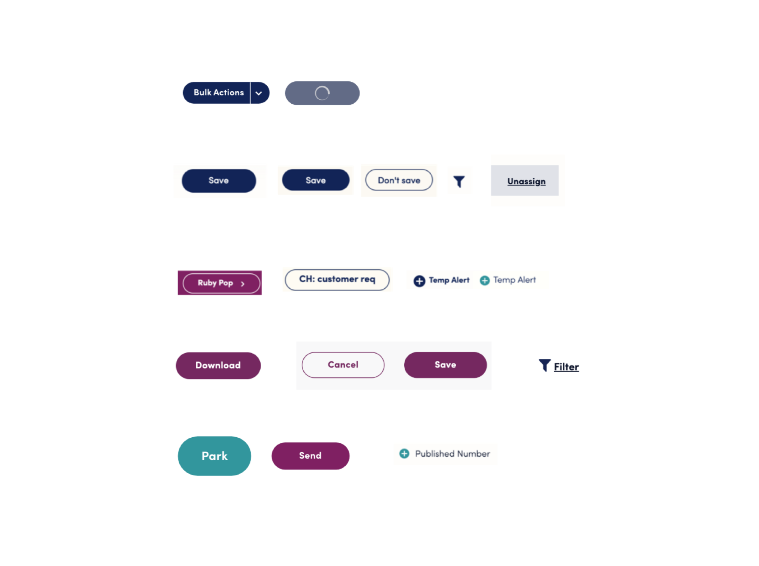
An example of inconsistent component styling found throughout the product suite.
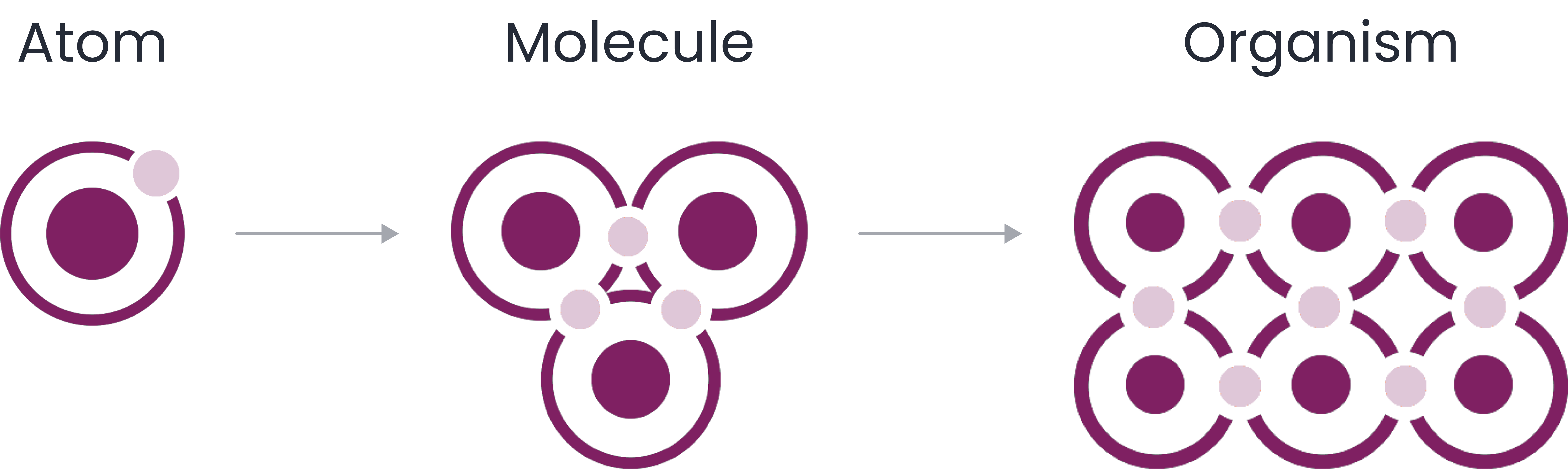
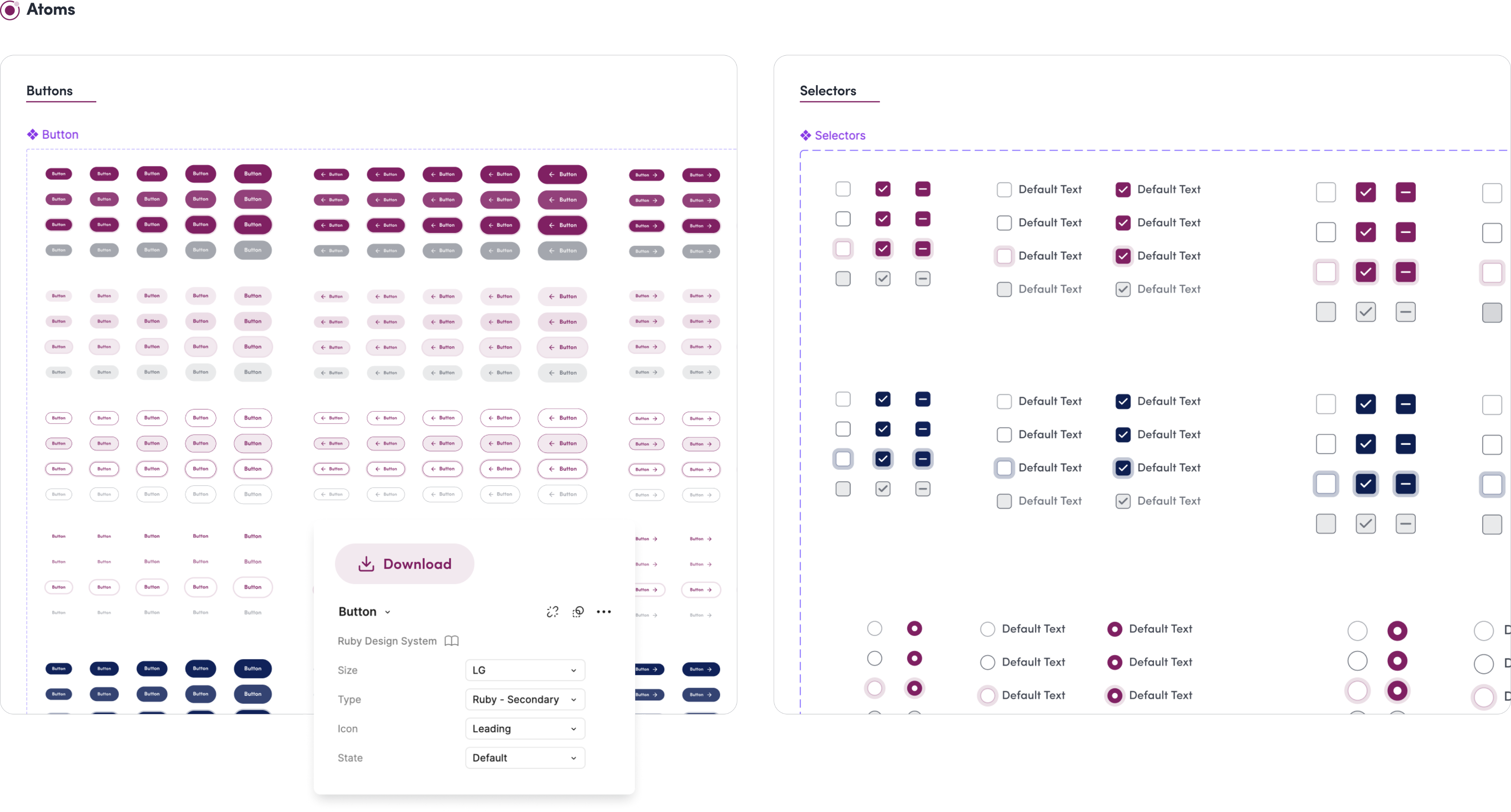
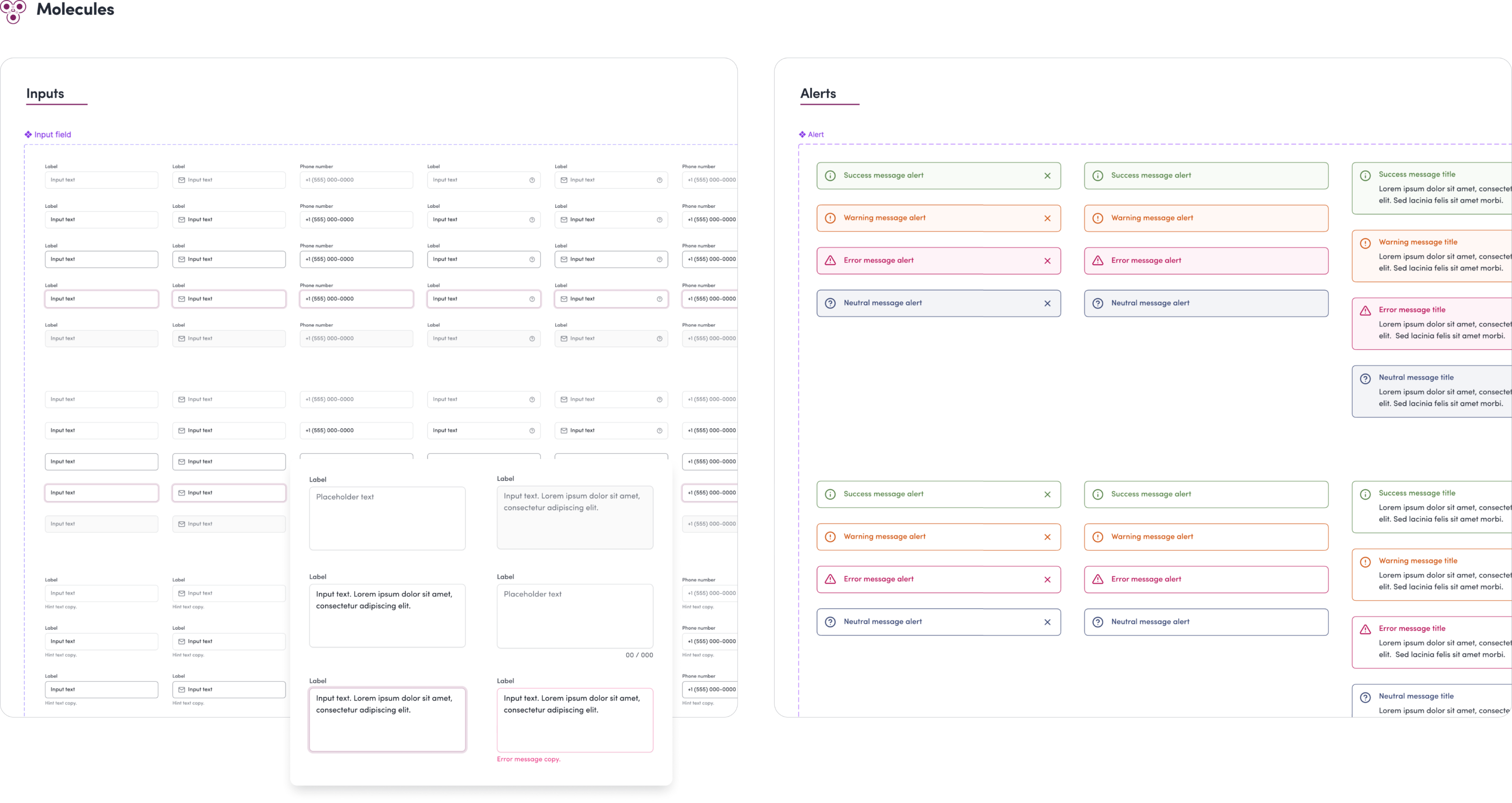
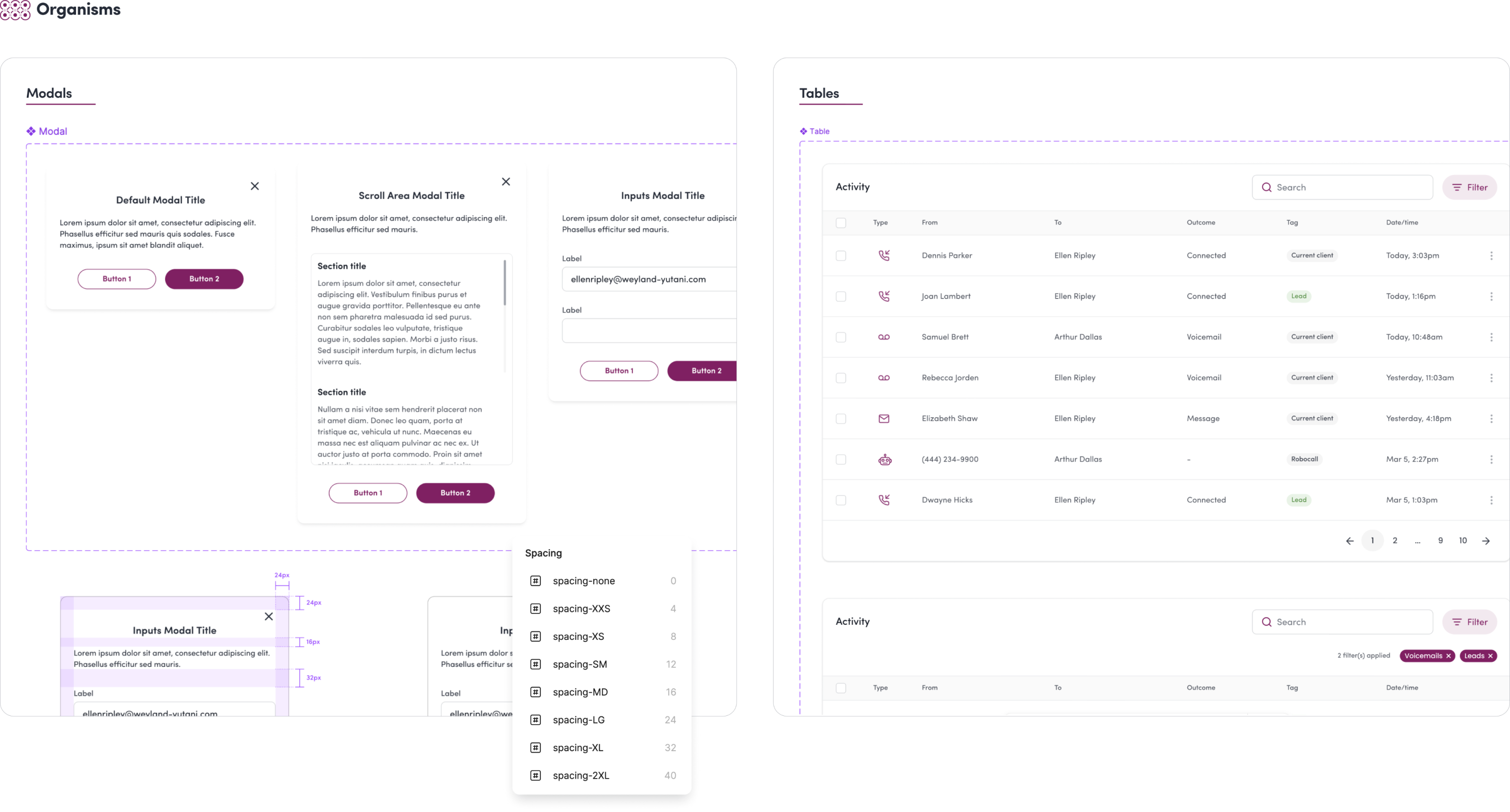
After finishing the component audit, we began by outlining foundational elements like our colors, typography, and grids. From there, we took our focused group of components and started breaking them down and organizing them according to the Atomic Design System.

Our developers recommended using Storybook to catalogue and code components. A meeting was held to prepare writing our first “stories” for components within Storybook. But little did the fellowship of the design system know, trouble was brewing…
Ruby had an unexpected network outage which required the full attention of the engineering team. Due to this sudden shift in priorities, progress on the design system slowed down considerably.
To manage limited bandwidth, we simplified our workflow by omitting Storybook and instead set up a hidden page in our QA environment for development and testing. We also took advantage of the component description feature in Figma to document guidelines and use cases.

Like any design system, ours was an ongoing journey of continuous improvement. It was very satisfying to develop a comprehensive set of components despite the initial setbacks, and the dedication and scrappiness of the design system fellowship made that possible.
Though the fellowship stopped meeting bi-weekly, we maintained an active presence in our dedicated Slack channel, and continued adding to and updating the system as needed.
.png)
.png)
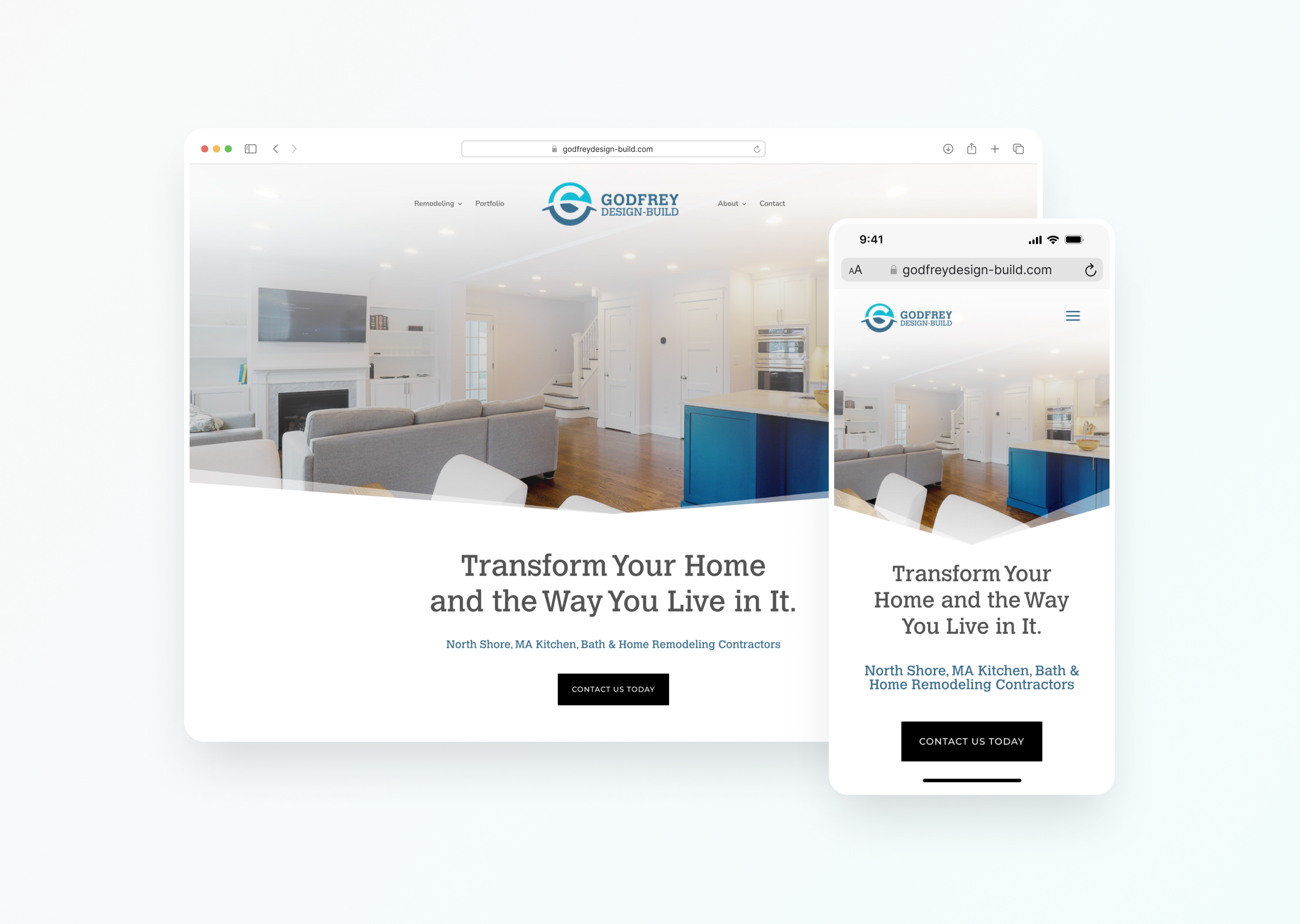
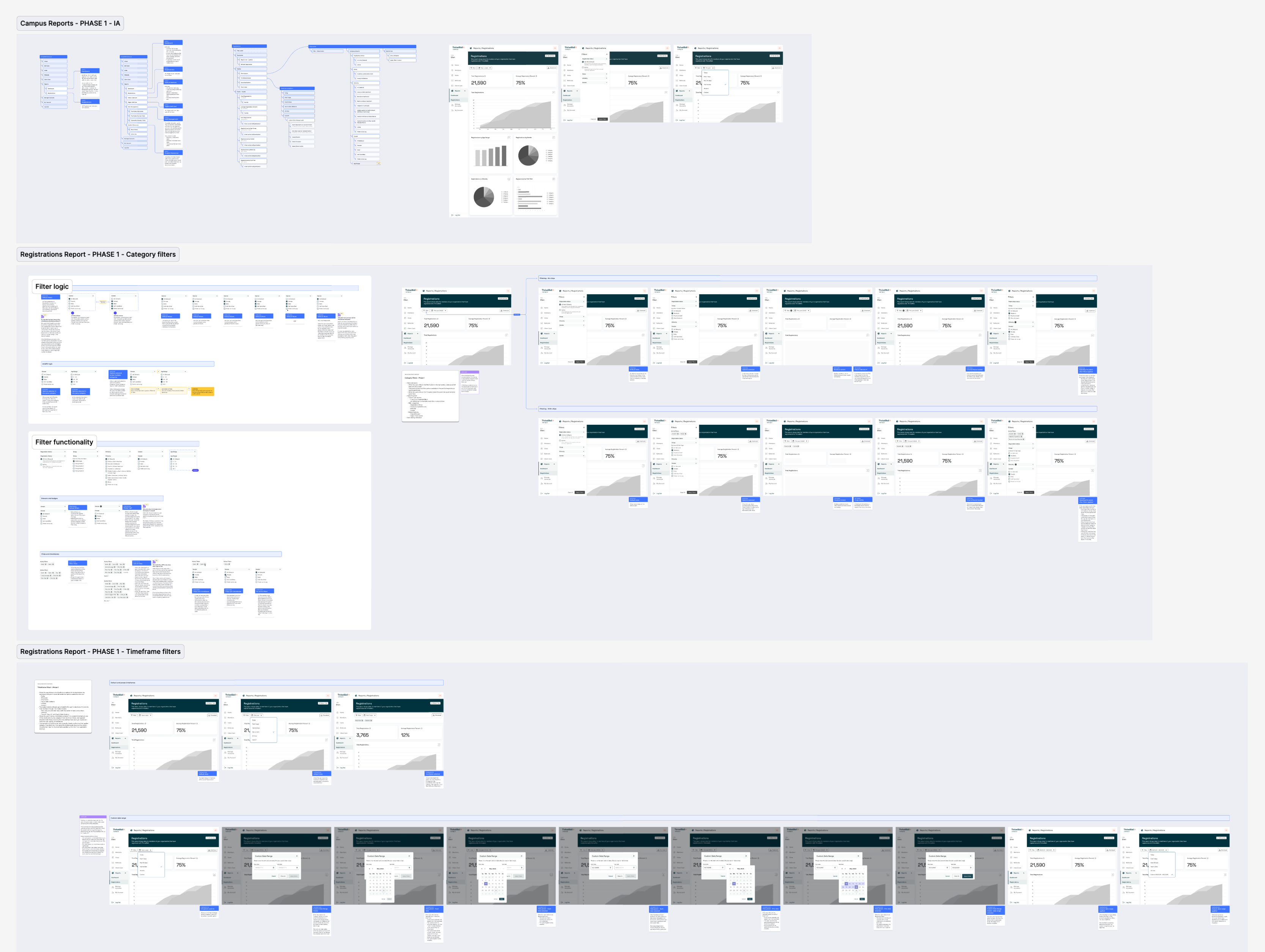
ThriveWell offers telehealth services to higher education students, including therapy, mental health support, and medical care. Customers use the ThriveWell Campus app to view reports that help them track student engagement and make data-driven decisions to support student well-being.
Campus app homepage
At the time, reports with charts and visuals were static PDFs generated through Looker. If customers needed a metric not included, they had to contact their CSM to request a new report, which was time-consuming for both customers and CSMs.
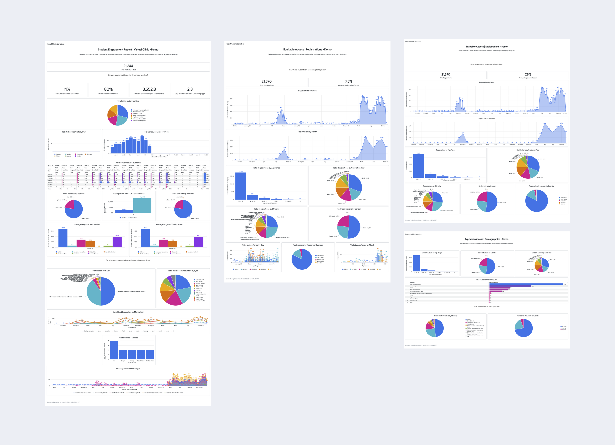
Original view of customer Looker reports
ThriveWell committed to creating new interactive report pages that would let customers visualize real-time data and filter it to their needs. I began by designing the overall structure the report pages would all share, then focused on translating the original Looker report data into each page, one at a time.
The first report page we built out was the Registrations page. Using that as a template, engineering and I will work to get the rest of the pages sorted.
.png)
.png)
.png)